I’ve been spending the last little while updating the UI.
In the Alpha build the UI was very simple and looked like a prototype. Function over form. In the first Beta build I updated the UI’s look a little – cleaned up icons, better layout, etc – but it was still very plain.
Keeping the UI simple has actually saved me a lot of development time, because I never cared too much about how it looked, it was easy to re-do screens and rearrange the UI layout.
However a gray background doesn’t cut it for the full game. Now that the game’s features have been pretty much implemented, I’ve been spending some time updating the look.
What do you think?
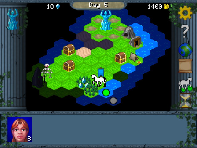
I’ll probably touch it up a little bit before it’s complete, but the overall direction I’m pretty happy with so far.